I am so excited about this club. Affectionately known (well, to only me so far) as ORMV. Thank you ladies for inspiring my creative mojo. I look forward to seeing your handiwork!
(A blurb about me:
I live in Albany, California. Here, the weather is wonderful, the views are breathtaking - and I can feed the many addictions of my soul: urban exploring, reading, eating (foodie style!), working ... and scrapping!)
Rachel
Rachel
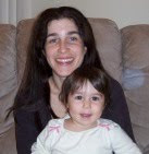
I recently moved back to California after many years abroad. I am proud mom to a beautiful little girl and enjoy scrapbooking, reading, film, travel and foreign languages.
Claudia
Rachel and Claudia
Claudia
I live in Burbank with my husband and our 2 kids, Gavin and Mia. Thanks to this club, my projects have taken over the dining room table... but that's what TV trays are for, right?
Marieke
Marieke
I live in beautiful Boise, ID, with my wonderful husband. To say that I have an addiction to scrapbooking is putting it mildly.
Tammy
Tammy
I am the newest member of the group! My husband and I recently (August '10) moved to Fairfield, CA from Rota, Spain. I am a native Florida girl traveling wherever the military takes us. I've been a card maker for quite a while but am looking to step out of my comfort zone and start scrapping a bit more. I am excited to start participating in the club.
Tuesday, July 13, 2010
Theresa's second July post
I don't think this qualifies technically as a layout. It feels more like pictures with a little decoration. In any case, it was kit inspired. I *love* that deep orange two-toned card stock.
I love seeing these photos! Italy is so beautiful. I love how you used the little letters for the title and how you matted them. Very cool! I also love how you incorporated the prayer beads. I love them draped up there like that - it looks really neat. I also love the passport here. How cute is that! I love that embellishment. I wasn't until I saw your layout that I realized it opened. OMG! That's an adorable embellie! It looks great with this layout - it matches perfectly with the map (which was a very cool addition to the layout) and the patterned paper. I also love how you scrapbook different sizes. I am not so adventurous. But I think I might be doing an 8 x 8 book for myself soon. I am toying with an idea.
Theresa, I loved this layout! So much so that I had to stop working on my second July project... which was of my husband's visit to Rome when he was in the Navy. Now I have to get yours out of my head! :) I loved how you used the orange paper through the middle, the matted letters that were off-center, and your writing in the passport. The beads are displayed beautifully, and the map makes a great background. The whole thing has a sophisticated feel, that I really admire.
I love that you wrote in the passport - what a great idea! Something about the torn red-orange paper behind the title (brilliantly shadowed in black) just screams Italy to me. Perfect.


I love seeing these photos! Italy is so beautiful. I love how you used the little letters for the title and how you matted them. Very cool! I also love how you incorporated the prayer beads. I love them draped up there like that - it looks really neat. I also love the passport here. How cute is that! I love that embellishment. I wasn't until I saw your layout that I realized it opened. OMG! That's an adorable embellie! It looks great with this layout - it matches perfectly with the map (which was a very cool addition to the layout) and the patterned paper. I also love how you scrapbook different sizes. I am not so adventurous. But I think I might be doing an 8 x 8 book for myself soon. I am toying with an idea.
ReplyDeleteTheresa, I loved this layout! So much so that I had to stop working on my second July project... which was of my husband's visit to Rome when he was in the Navy. Now I have to get yours out of my head! :) I loved how you used the orange paper through the middle, the matted letters that were off-center, and your writing in the passport. The beads are displayed beautifully, and the map makes a great background. The whole thing has a sophisticated feel, that I really admire.
ReplyDeleteI love that you wrote in the passport - what a great idea! Something about the torn red-orange paper behind the title (brilliantly shadowed in black) just screams Italy to me. Perfect.
ReplyDelete