


As usual, these are for Kurt's albums. I am so glad I had not done the Hawaii layout yet. Yay!
I spent a LONG time on these. I customized a lot of the embellies, used my cheapy watercolors to make more patterned paper, broke out my Copics, and even used my sewing machine.


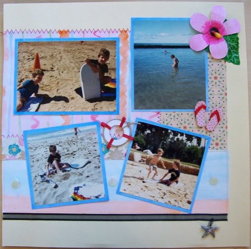
I made the hibiscus flowers using a tutorial found here. Mine don't look exactly the same, but close enough. I painted white cardstock pink with the watercolor paint, then used my Copics. I colored and added the q-tip head for the center (such a clever idea - I love it and would never have thought of that). For the leaves I took white card stock and a green stamp pad and just stamped directly onto the white cardstock, then used my white Sukura Souffle pen to add the veins.
I made the patterned paper behind the photos - the one with the squiggly lines - using my watercolors and stitched around the edges with red thread to make it a little less like kindergarten crafting hour (as T says). I also tried to cover it up with the photos and embellies since it was so messy. I mainly just wanted a paper to tie in all the colors. I loved that there were so many colors in this kit - it gave me the freedom to use as many of my markers as I wanted.
I hand-stitched the starfish to the black ribbon so it dangles and moves. For the title, I printed out an outline of the word Hawaii, colored it in, cut it out and added the white dots. I also watercolored the paper that the title sits on. It was supposed to be orange and blue. It's now peach and blue, but I like it.


Again, I made a lot of the paper here using cream cardstock. I painted the main background paper and used copics for the bottom border. I used a black permanent marker to get that top border.
I personalized a lot of the embellies on this one. I colored the white flower yellow to better match, I added "The Sights" to the the postcard to use as a title and I added a blue strip (made by coloring white paper blue with my copics) with the words "The Punchbowl, Waikiki, Diamond Head and North Oahu" printed on it to the yellow circle tag. Again, lots of sewing.
I made the palm tree using some of the Kraft paper and some of the left over green stamped paper I'd made for the hibiscus leaves. I then circle punched some coconuts, shaded the edges, and then used foam tape to get a little dimension.
I used a portion of one of the quotes and came up with my own ending to it. It now reads "travel is more than the seeing of sights, while discovering new lands, you discover yourself". I'm pretty sure the part I came up with is some other quote I've come across before so it turned into a mix of the two quotes.
I had a little bit of black ribbon and so I added it here just to tie it all in some more. The mats were made by using white cardstock and coloring in the edges, the portion that would show.
Well, I have one left to finish and I'll post that one as soon as I get it done - probably tomorrow morning.
Again, I loved this kit and it was so nice and very inspiring to work with new materials.
Updated 7.9.2010:
Final Layout: Road Trip


Okay, so I cheated a little. I used blue printer paper. I swear I wouldn't have if I had a printer that used ink instead of toner. Toner doesn't stick to cardstock or vellum. It flakes off. And white printer paper just would not have worked here with the cream background. I apologize for cheating.
For the background of the journaling tag, I used the packaging the velvet flowers came in. The journaling reads:
Barb’s new car prompted this road trip.
I'm not sure I like the title, so I haven't permanently adhered it yet. I'm still deciding.
I cut the brown patterned paper mat into 4 strips to make borders. The vellum covers the seam on the bottom and if I stick with that title it will cover the seam on the top.
The only other thing I changed was the compass. It was originally layered with "Holland America Line" on it and it just didn't go, but I liked the compass part, so I separated them.
Okay...all finished for this month.
I am so blown away at how creative you are. I didn't see nearly as much possibility as you did. (I got stuck on that one little piece of paper and just went to town.) I was somehow afraid of putting all of the paper together (or more than one pattern at a time). I like the way it looks on your layouts though. I need to be more assertive in my designs.
ReplyDeleteNeedless to say, I'm impressed! I'm also jealous that you have (and know how to use) a sewing machine. I love that look, but am doomed to admire from afar.
My favorites are your use of watercolors and the made-from-scratch leaves and palms. I never would have thought of that.
It seems like Kirk's album is coming along very well. You've done a lot of layouts for in in the club. Almost done?
You are making me want to get Copic markers by the way. Anth covets them every time we go into the scrap store. Sigh. Those things are expensive!
I think switching it up next year is *great* idea. Even though it's a while yet - I am already thinking about it. Did you get my email about next year? The embellishment idea was one of the options, I think. I like the idea of hosting though. That way each person can do whatever they want!
I'm having fun! Thank you so much for starting this.
This week, while I'm fondling through the Aug kit, I am also working on my first mini-album (which I purchased naked from the Punky Sprouts line). Have you heard of those? It's been fun experimenting with multi-media / multi-surface. I'll take pictures when I'm done.
Ciao for now,
Theresa
Sorry, I spelled Kurt's name wrong. What was I thinking?!
ReplyDeleteMarieke, you amaze me! You worked wonders with the materials given, and you added so much with your creativity. I love that you sew, and I love that you painted/colored your own paper. I would never have done that, but I am making mental notes for the future. The Hawaii title looks too cool, and I really like the palm tree and the leaves with the veins. I wish I had thought of cutting off the wires for the flowers I used in my layout, such a simple solution to an embellishment I had a bit of trouble with. The little black ribbon tag you added on the second layout is very cute... again, making mental notes. I feel bad that I don't have much crafting experience and technique to contribute to the group; I know I will end up getting so much more out of this than I could ever put in! Can't wait to see your third layout.
ReplyDeleteYes, Copics are expensive. I wouldn't own them now if it hadn't been for The Crazies. (What I call the time period of my out-of-control scrapbook indulgence - and that is putting it very nicely.) In many many ways having a budget of $20 a month now is a good thing. I have learned all kinds of life lessons which seemed to have escaped me up to this point in my life, such as: restraint is a good thing; when you save up for something you appreciate it a lot more; or the fact that a lot of the things I think I simply must have at the time are things I don't even want a couple of months later.
ReplyDeleteKurt's album is coming along. I am so close to being done. I am really trying to finish it up this weekend but I've been saying that for so long now... so who knows? However, if it isn't done by Tuesday, it'll have to wait because I need to start organizing for the move. We get our truck on July 26, load it up and are gone on the 27th. My goal is to have everything moved down to the first floor so that there is no up and down of the stairs. Our truck can back up to literally 2 feet from our front door. Our apartment has a front stoop with 2 steps so our apartment's first floor will be about even with the truck's bed. Once we back it up to the front door, we'll use the ramp as a bridge between the truck and our apartment's first floor. Does that make sense? So everything should load nicely - the operative word being "should".
Yes, I know of the Punky Sprouts line. Very cute stuff. I am a big fan of mini albums, though I've never made one (other than the acrylic Blue's Clues one for Hanna's b-day). I can't wait to see pictures of what you do with it. There is a really neat book called "Outstanding Mini Albums" and it has some of the cutest ideas. I checked it from the library and now want to own it. You might want to see if it is available from your library. Also, it might be cheap through Amazon.
My God, where do I begin? I can't believe you made this many layouts, first of all. Crazy! I love how they each have such a distinct color scheme. The Hawaii title is fabulous, as are the hibiscus flower and the stitched patchwork background of the patterned papers. I remember when I was putting the kit together, I was thinking to myself: Marieke is going to freak out because these papers don't really go together, she probably won't even use them...well, I guess I was wrong! I really liked how in your "the sights" layout you used the typewriter key letters on the post card to create a title (in fact I totally stole that idea on my second as-yet-to-be-posted layout that has been foundering on my desk for over a month now, but I digress). The color scheme of the Road Trip layout has a very vintage feel that complements the photos so well. Brilliant!
ReplyDelete