


Here is the first layout I made:
 I won't lie. I'm not crazy about it, mostly because I know Marieke loves these photos and I am certain she would have done a better job with them. But I do like the simplicity of it, as I really didn't want to distract from the photos so I kept the embellishments to a minimum.
Here is the two-page layout:

This is a scraplift, and marks a lot of firsts for me. As hard as it may be to believe, this is the first time I have ever printed anything on cardstock, and the first time I have ever made a computer-generated title (who knew MS Word had such cute fonts?). I usually prefer to use my own handwriting and make titles from letter stickers. This page was a bit of a gamble (whether to leave so much white space) but all in all, I'm happy with the way it turned out.
Here is a closer look:
 I used the square punch-outs from the kit as a template to trace squares from the patterned paper supplied. I also used a paper piercer to poke holes along the edges of some of the hearts in the patterned paper.
I had a lot of fun with the title, and the hand stitching, which I suck at, but amazingly, still enjoy doing.
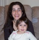
Next, I flipped through some old pictures to see if anything jumped out at me, in terms of color. And I stumbled upon this:
I call it "Preschool me."

Layout #4:
 The title is cut from a photograph of crayons arranged to make letters spelling Hanna's name. The photo corners are the negatives from tracing around a clothing tag to make the journaling tag. More fun with hand stitching here. This is the first time I've ever tried to pleat ribbon (I'm not even sure if that's what it's called). The petals of the flower contain the "outtakes" of my first attempt to print on cardstock for the two-page layout. I really used almost everything this time.
Here is my card:


Wow, Rach! I am super impressed with the amount of layouts you created with this kit. I am even more impressed that none of them feel “cheated” by using the supplies so efficiently. They are all beautiful and feel full, well-constructed and deliberate, not skimpy or minimal. Great job!
ReplyDeleteI love the Hanna/camera layout! She’s such a cutie! And you are right – l do love these pics, although, I only remember having seen one of them previously. It’s a treat to see more. I like that you went light on the embellishments here. It does make the viewer focus on the photos and isn’t that the whole point of scrapbooking? I like uncomplicated layouts just as much as more heavily embellished layouts. It just depends on my mood. I think I got into the habit of going heavier on embellishments and layering because I’m not really into the whole photography thing and don’t really have much going on to scrap, like a child’s experiences, so when I make layouts they are usually for other people and the embellishments and paper are the end product for me. Often, there are no photos for me to focus on. I stop just before the point where they get added. So, all I am focused on is adding lots of embellishments and more layers of paper. It’s only recently that I’ve scrapped some layouts of Hanna where I have the actual photos before I start. And if you notice, those are my simpler layouts. Having photos to work with makes a big difference. When I think about my wedding album or some of the layouts I’ve done previously, I am just as fond of the simpler layouts as the more complicated ones.
No, I don’t think I could have done a better job. This layout is great! I love how the photos are fanned out. I love how you swapped the “o”s in “Love” and “You.” And I love how you used the pale green gems here to match the pale green circles on the borders of the paper. You did an excellent job!
The “Lil’ Sweethearts” layout is so cute! The photos coordinate with the paper so well. I love the squares of different paper. I am totally stealing that idea. I love how you put the hearts in the plain green squares. And of course, the border is just too cute! I got the idea for the scalloped border in my Spencer layout from your layout last month, so you know I like this look. I really like how you used the paper piercer to poke holes along the heart borders in the paper. What a cute idea! I have seen cards where the paper piercer was used to make designs in the corners but I’ve never seen it used to accent the pattern on a paper or used in a layout before. I love it! Very cute title. The wording goes perfectly with all the hearts. Now, if I could just get my printer to accept cardstock…
The “Preschool Me” layout is adorable. I love how you muted the tone of the paper by using vellum. I also love the hanging trio of hearts. What a great way to add movement to the layout. I adore the overlapped stitched hearts. I remember thinking how cute that would look way back in December when I was putting this kit together and then I totally forgot about it. In one moment, out the next. It’s awesome you thought of doing that. It looks really cute. I wish I’d not had a brain melt on that one. Oh, well, there’s always some other time. This is a very cute photo of you, btw :-)
ReplyDeleteThe “My Hanna” layout is really neat. I love the techniques you used here. I’ve seen ribbon pleating on TPIAB but have never tried it before. It looks really cool – you did a great job. Was it hard? I love the “Hanna” written out using crayons and then photographed. I LOVE how you use photos in original ways, like how you used the party hat as embellishment last month and now photos for the title this month. It’s so creative and original. I just love it. I also adore your flower. It looks great! I love how all the petals are different papers. I hate to say it, but this is paper piecing. You are doing it already. You can get over any qualms you may have because you already excel at it. The stitched leaf is very cute. What a great way to incorporate the stitching again. I also have to say I love how you used the extras from the tag as photo corners – an ingenious use of leftovers. I am a hoarder of supplies and I am stingy with my scraps. I don’t like the idea of throwing anything away. (In fact, I think a fun challenge would be to create baggies of scraps and exchange them with others to see what could be made from them.) So the fact that you used the corners from making your tag makes me love you all the more. :-)
I love your card. Again, I love the look of the overlapped hearts. Very sweet!
I love your whole group. I know how busy you are with Hanna, how little sleep you get, and how exhausted you are from chasing a two-year old all day (I love her, but know how tiring she can be), so I just want to say thank you so much for making the time and using up what little energy you’ve got left to create such wonderful items. It has been really fun seeing all the different techniques, designs and styles we all come up with.
I love the Hanna layout with pictures at the beach. Photos are always the first thing I start with and these are precious. I had no idea what to do with the pink/dot paper. For some reason it didn't occur to me to use it as back ground, but I like the way it came out in yours. I also have never used anchors before, so it's nice to see them in action.
ReplyDeleteDid I mention I love the photos?! :-)
I absolutely laughed out loud when I saw the lil' sweethearts layout. That picture of Hanna in the bathroom is priceless.
ReplyDeleteThe tiling of different patterned papers and unique stitching is cool. I never thought of that, but I like it.
I think you get the award for most creative photo use. I love that you made a title out of photographs. I use fonts because I don't really like my writing. I like it when you write in your journaling spots because it's so clean and neat. My chicken scratch is loopy and crazy. Not nice. As far as learning about fonts... It's all trial and error. I'm working on a mac so I don't know if the fonts are the same for MS Office - MAC vs. MS Office - PC. In any case, you can get pretty creative without a whole lot of effort. :-)
I should also mention that I dig the double stitched heart. It's cool to see how we all used that pattern in different ways. That's why I like this club so much. Cheers!
Thank you so much for your comments! Marieke, in response to your question: the ribbon pleating thing was ridiculously easy. That aside, I still managed to mess up the first couple of pleats but it's such a laid-back technique that I don't think anyone but me would ever notice. I really like your idea about trading scraps, by the way. I can totally see the three of us taking that and running with it!
ReplyDelete