Layout
So I have been building this layout since we went to Borders back at the beginning of January and I flipped through some magazines, spotting some really neat ideas (the hanging hearts and the scalloped photo mat). I cobbled those and some other ideas together - a sort of Frankenstein layout, if you will. I like the way it turned out. I really LOVE the polka dots. That turned out much better than I had envisioned. The only thing I would change is I would move the larger photo closer to the center a little bit, but it's hard to get it just right with so much going on here.
The polka dots are done with a stencil I created by punching a circle in some of the leftover light green cardstock and using white ink. (I feel like I may have "cheated" a little here because it says we can use ink pads for distressing or shading. My use of an ink pad here doesn't exactly fit either of those, but I really wanted to try it and felt the technique fit the spirit of the rules - that we use things all of use can do and that don't require unique or special tools. I apologize if you feel I cheated.) I suppose I could have avoided this feeling by just cutting a bunch of the same size circles out of white card stock and gluing them on, but I wanted to try this technique.
The lettering was done like last time. I printed out the letters on paper, then cut them out, then traced them onto the hot pink paper. I actually had to do that twice because I chose light pink and light green the first time around and did not think they stood out enough.

The scalloped mat was created by punching out a zillion circles, pasting them around a piece of paper the same size as the photo, then hand tracing and cutting. I decided to distress the edges and after that didn't seem like enough, I outlined it in hot pink.
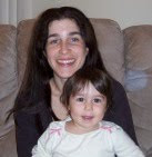
I knew Spencer's office walls were painted green and I love the color of this shirt. He was sweet enough to volunteer to be my model so we went to his office and took a bunch of different photos. I really liked how the photos turned out, but when we developed them, they came out darker than I would have liked. I really need my own photo printer...
Below you can see the photos look much nicer than in the layout.


(If you look closely, you'll see we put the Two Peas in a Bucket homepage on his computer screen. ;-p)
Cards
So I had a TON of ideas, but settled on these. I wanted to try out something different than last month. I wanted to challenge myself more. Some I like better than others. I like how the three stitched flowers came out. That one turned out the best in my opinion. I wish the lamb's back legs were set at an angle pointing down so she looked more grounded. I saw the flourish card in a magazine. It should have stayed there. I don't like how it turned out at all. And the dragonfly looked much better in my mind than in reality. Oh, well, you can't win them all.


So I really like this one. I love how the stitches are stems on the front and "hang" the hearts on the inside. I saw the heart shaped leaves in a magazine and knew this would be perfect for this month's color scheme.


This is going to be Hanna's Valentine. The lamb turned out better than I had hoped, for my first time making one, but I do wish I had angled the legs downward so she didn't appear to be floating. I colored white cardstock black in order to make her nose and hooves. I used pink ink to shade the ears and cheeks. The bottom border I made using pens and white card stock - which was actually made for the layout but I decided against including it there and used it here instead.

I liked the simplicity of this design and the color scheme but it just doesn't look as spectacular as I had hoped.

I originally posted a close-up of the card as it was in the group photo. But, I hated the wing placement so I decided to move the wings up. You can see in the group photo they were further down his body. This is much better. A slight adjustment is just what was needed.


 I won't lie. I'm not crazy about it, mostly because I know Marieke loves these photos and I am certain she would have done a better job with them. But I do like the simplicity of it, as I really didn't want to distract from the photos so I kept the embellishments to a minimum.
 I used the square punch-outs from the kit as a template to trace squares from the patterned paper supplied. I also used a paper piercer to poke holes along the edges of some of the hearts in the patterned paper.

 The title is cut from a photograph of crayons arranged to make letters spelling Hanna's name. The photo corners are the negatives from tracing around a clothing tag to make the journaling tag. More fun with hand stitching here. This is the first time I've ever tried to pleat ribbon (I'm not even sure if that's what it's called). The petals of the flower contain the "outtakes" of my first attempt to print on cardstock for the two-page layout. I really used almost everything this time.


