Tuesday, March 23, 2010

Theresa's (belated) March Results

Hello crafty ladies!

I am sorry for my recent absence. Alright, my extended, recent absence. While life has taken it's twists and turns, I'm ready to get back into something that makes me happy: scrappin'!

I was going to start back with ORMV in the May kit. However, I really loved the papers in March - so here is my humble offering.

Layout #1

These photographs were taken at my 25th birthday party.... almost 10 years ago!

These were good times, I tell ya. I think the paper patterns capture my nostalgia for the period, which is why I wanted to do this.


Layout #2

I don’t find a whole lot of creativity in this – but I loved the bird image and it reminded me of this photo – which was taken on our first vacation. So, I just put them together because I couldn’t bear giving the bird image away in a card, which was my first instinct when I saw it.


Cards 1,2,3

These are some TY cards, which I created because I didn’t want to stop working with the bird paper! As it turns out, I needed some – so alls well that ends well.

#1


#2

#3

Thursday, March 11, 2010

Rachel's March Results

When Marieke first gave us these kits for Christmas, March was my favorite on first sight. In fact, I immediately stole a couple of embellishments to use on a layout with a bird theme that I was working on at the time. When I sat down to brainstorm a project for this month, I began to search my photos that went with the color palette or that had something to do with birds. I came an almost ten-year old across a photo of myself in Venice and the idea of “free as a bird” popped into my head, and I immediately toyed with the idea of doing an album on my carefree twenties. I found an album that I had went with this month’s colors:


I thought I liked the idea of an album about traveling with friends, from which emerged the “birds of a feather travel together” theme. I dug through old memorabilia and created this page on a trip to Ireland to visit my friend Elaine:


Then I scrapped that idea, once I realized that I had bitten off far more than I could chew. Then I had an epiphany: I could create a basic template, which could be repeated throughout the album. I have been wanting to try journaling with the computer, which I have never done. Here is how that experiment turned out:


I tried to use colors that went with this month’s scheme. And in retrospect, I am not so sure that using a text box is “legal” but considering how little paper we had to work with this month, I am amazed that I was able to create an entire album out of what I had. I also cheated and used staples on the tags (it’s sort of an adhesive, right? Uh, yeah, no). I decided to make memorabilia pockets into which I can later insert ticket stubs, extra photos, and other souvenirs. The idea to create a collage of photos was a question of time: no need to crop photos.


I scrapped the opening page of the album last, because I thought it set the tone for the remaining pages, which are all about trips I took over a two-year period.


No cards this month. No paper left!

Tuesday, March 9, 2010

Marieke's March Results

I found this kit to be the most challenging thus far because of the lack of variety in papers. The two previous kits had extra paper and I really missed that with this kit. For the other five kits I'll be doing, I will be sure to include extra cardstock.

LAYOUT

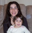
This layout is for the album I am working on for Kurt. This photo was taken around 1978. The journaling reads, "This is Cyn with her friend's baby. Cyn must have made a wish for her very own sweet baby this day because about a year later, Spencer was born. That's the way it usually happens. A woman holds a baby and soon she has her very own." The journaling was based on what Kurt told me about the photo as we were going through his albums at Christmas.

I scraplifted this layout from one of my favorite scrapbookers, Gabrielle Pollacco. You can see the layout by clicking here to go to her blog, Such a Pretty Mess. She designs for the kit of the month club, My Creative Scrapbook, which sells the most delicious (if spendy) kits around.

I like how the layout turned out overall. If I could change anything, it would be the distressing on the polka dot paper. I think it's a bit too heavy and it looks even heavier photographed - it's not as bad in person. It also looks slightly orange in the photo and it definitely is not in real life. I guess photos can lie.

I took a nail file to the brown paper to get to the white core. Gotta love white core paper for distressing.

I edged the brown patterned paper with a gold metallic pen.

I used circles for the white scallop border and did a search for "scrapbook borders" for the scalloped border above it. Here's the image I used:

I pasted the image to a word document, sized it to how large I wanted the scallops, printed it, then cut out the scalloped edge. Then I traced the pattern onto the pink paper. I had to repeat it since it wan't 12 inches long. Then I cut that out, and distressed the edge in pink ink. I love how distressing hides the major hand-cutting flaws.

I turned the square bird tag into a circle and colored in the flowers.

The hearts are hand drawn and cut out, then distressed.

The large flowers were made from templates using images from on-line. I created a striped paper for one, using cream cardstock I distressed and striped with a red pen. I used the pink organza ribbon as one of the flower centers, by gathering it with thread. Since the rules allow for stitching I decided to go ahead and stitch the ribbon into a rosette. I triple stacked the white die-cut flowers to get some dimension.

CARDS


I hadn't realized how autumnal these colors were until Spencer pointed it out to me, but they do look very fall-like to me all together like this.


This is my favorite card. This is the first card I've created without scraplifting and I really like how it turned out. I had created the flower for the layout but decided against using it there and included it here instead. I colored in the heart with a red pen.


Probably my next favorite card. I liked how this turned out a lot. I hadn't originally thought of this sentiment or title for use on a card but I like it. I created the mat using white cardstock, which I then colored red at the edges. Same thing with the flower's center. I definitely should have included red cardstock with this kit. Live and learn.


I saw this idea in a magazine and decided to go for it. Not sure about this one. I think this idea would work better on a larger card, using smaller punch-outs.


Eh, meh. This feels so boring to me. I feel like I've done this a thousand times before. Nothing new to see here, folks.


Also something I saw in a magazine. I like repeating patterns and thought this came out cute. I wish I had put the ribbon up a little higher in the center of the pink section so you could see it better, but other than that it's fine. It's nice to have a few blank cards around.

So this month, I used almost everything in the kit. I only have a couple of wish phrases left. Not too shabby and much better than last month. Cant's wait to see your paper goodies, girls. :-)

Saturday, March 6, 2010

March Kit

As always, please let me know if you are missing something. I'll send it right out.

This month's colors:
Main: Brown & Pink
Accents: Red & Green
Neutrals: White and Cream

1. Paper - 4 Sheets (2 patterned and 2 plain)


2. Additional Paper Items - 1 bird journaling tag and 1 stamped flourish tag


3. Ribbon - 1 thin (white), 2 fat (pink & brown organza)


4. Brads - 4 brass & 4 pink flower


5. Bling - 1 brass bird and 1 jump ring


6. Embellishments - 2 stamped images (1 red flourish bird & 1 group of birds) and 3 types of die cuts (6 of each design) - leaves, flowers and birds (the leaves and birds are double-sided.).


7. Titles - Stamped "Cherish" and chipboard "Wish"


8. 2 sentiments & 1 sheet of phrases

Wednesday, March 3, 2010

New Layouts from Rachel

I am posting these layouts Rachel sent to me(Marieke) in an email. I thought they were just too cute not to post.

You & Me


I love the symmetry and continuity of the photos - specifically how Hanna and her grandparents are all facing forward in one of the photos and also had their backs to the camera in the other photo so you got the effect of them coming and going. This symmetry is also present in how there is a photo of Hanna with each grandparent.

I also love how Rach added green crystals to the center of the flowers printed on the brown paper - so pretty. And these patterned papers (pp) are truly gorgeous.


Neighbors


This layout held a lot of meaning to Rach and holds the story of a beloved jacket. Lots of deliberation went into choosing just the right fabric swatches and I love how they match the green jacket and the lettering in "neighbors". Rach tied the elements in the page together by mirroring the shape of the large die-cut frame to the journaling tag and by adding just a touch of pink floss to bring out the color in the top her mom was wearing.

I love them both, Rach. You are truly gifted.